hire me
Even though I am taking it seriously (really...my bank account balance insists that I do) my first inclinations on the re-working of my résumé have thus far been inappropriate and/or absurd.
Almost immediately I thought, "Shall I use Comic Sans to highlight my design education?"
And speaking of typography, it's not a bad idea to focus on it. Perhaps creatively overlapping type and introducing hierarchy by varying its size in relation to my skills/experience. (Hostess at Postrio: small. Assistant to Manfred Krankl: BIG. Haven't worked in 8 years: small. Excellent attitude: BIG.)
Or how about the reworking of the classic Rodchenko poster. Lilya Brik's urgent call will blare out: "Pick Sacha!"

An aside. Recognize the image, Jana? We used it for the cover of your Fiat Musica program. Using a fascist poster for a choir performance at a church brings such enjoyable irony. As does using it for seeking employment.

A flier is not a bad idea, actually. But no fold. More like a faux community newsletter highlighting my art making, graphic designing, always organizing, award winning wine blogging, fun house party hosting, life loving self. With testimonials. And maybe boring stuff like past work experience, software skills, college education, and whatnot.
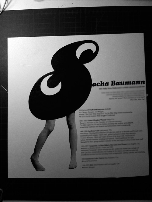
I scrounged around my metro rack of clippings and magazines and scraps of inspiration and came across the pieces of last year's birthday party invitation.

For fun I arranged the elements again, took a picture, put it in Photoshop and dropped in some dummy text. (Yes, I know you're suppose to do the text in Illustrator. Yes, I know my name is not dummy text. And yes, I know the correct term for dummy text is "Greeking.")
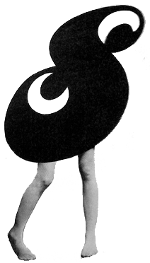
Even in a fast and dirty job, I think it's cute. But does it send the wrong message? And what exactly is the message? And what is it with this obsession I have with adding sexy legs to things?

I do love that leggy ess. And it is highlighted nicely by not cropping out the dark background. Although the HR person might get annoyed at how much black ink is used when printing it out. And at the leggy ess in general. Next.
Okay...I'm back to work. On working on my résumé. And on working on getting back to work, of course.
